Intro
So my idea was simple: I'm a huge sports fan, and usually, when September hits, it's the start of the hockey and football seasons that I'm always looking forward to. However, this year was a bit different as the Toronto Blue Jays of baseball are going on a tear en route to the World Series, and as expected, I'm bandwagoning pretty hard. So anyway, my idea was that since I would use the Blue Jays motto for the 2015 season as my quote: "Come Together." Simple as that.
First Sketches
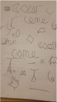
So I started off just sketching out some basic ideas. At this point, I really had no idea what I was going to do with the two words, and what effects I would add. How did I want the two words to contrast? Should I go simple? Or should I go a bit more exotic? What else should I include? The Blue Jays' logo? Maple Leaf?
Second Sketches

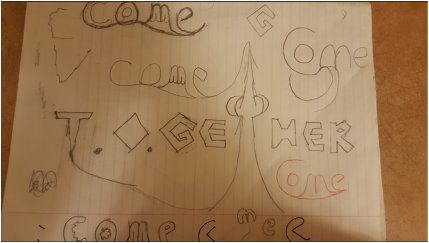
Idea was coming together (no pun intended) on sketch 2. I wanted it to look fairly simple, quite like an advertisement. I was going to use smooth handwriting on top for "come," and make "together" a bit for hard and defined. Some symbols I decided to use were the base representing the "O" in "together," and the CN Tower representing "T."
Final Sketches
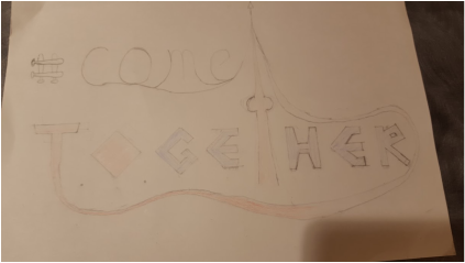
At this point, I was starting to get a hold of what the finished product would kind of look like. I was still playing around with "come," as I felt it was just a bit too plain. For "together," I decided that I wanted the font to look sharp, almost as if you took the base in "O" and cut off some parts of it to make each letter (that'll be a bit more evident in the finished product).
Good Copy-Start
I wanted the good copy to be perfect, so up until now, I've taken quite a bit of time just writing down the two words. I've added an extra touch by underlining both words with their respective first letters, and connecting them to the top of the CN Tower. For colouring, I obviously had to go with Blue Jay colours-red and blue. Everything was going to be blue, other than the "T" and the "O" and the tower, in order for them to stick out (T.O. is for Toronto).
Good Copy-Finish
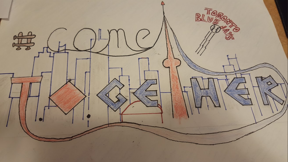
Done! I decided to add the Toronto skyline as you can tell, because it was looking very empty with just the two words. I spent 30 minutes just pondering whether I should outline the buildings with blue or red, I went with blue; I thought if I had went with red, CN Tower and Rogers Centre wouldn't stand out as much. It turned out quite well after all. I thought the flying baseball out of Rogers Centre was also a nice addition, I wasn't very happy with the font of "Toronto Blue Jays," however. The background was also coloured softly with light blue to make it less bland.
Summary
I'd give myself a 5/10 on this project. This isn't because I don't like my finished product; more of it has to do with the over-simplicity of the whole thing. Because this project was supposed to be a "lettering" assignment, I don't think my finished product fit the criteria too well with two very simply fonted words. If I could re-do this, I'd probably choose something different to work with with more words, and perhaps be a bit more risk-taking and exotic in my attempt.
 RSS Feed
